I’ve always been a fan of drawing page components with pure CSS rather than using image support. Although rendering the page with CSS can sometimes be a pain, the rewards of fewer HTTP requests & less download time make it well worthwhile.
Until recently, most web designers and developers couldn’t design using CSS alone, because there simply wasn’t enough cross-browser support for all the wonderful CSS3 attributes.
However, with IE9 just around the corner and Opera 10.5 already released, we are extremely close to the point where we can render web pages in CSS3 across all modern browsers (IE, Firefox, Chrome, Safari, Opera). Legacy browsers won’t get left out, since our CSS3 pages can degrade gracefully to square corners, flat-color backgrounds, etc. Additionally, we can use browser-specific stylesheets that include plain old image support for key design elements that shouldn’t degrade.
CSS3 makes drawing elements with CSS a whole lot nicer. Besides easy-to-use attributes such as border-radius and box-shadow, CSS3 introduces some very versatile new attributes such as RGBA opacity on any element with color, and a variety of CSS gradients on background, text & borders.
Let’s go through some examples of drawing with CSS so you get just as excited as I am:
CSS Triangles
Although CSS3 support makes drawing pages with CSS a lot easier, the concept is by no means new. Here’s a trick for rendering triangles of any shape using CSS alone. Works in all browsers down through IE6.
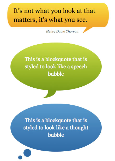
CSS Speech Bubbles
These CSS speech bubbles take the CSS triangle trick to the next level, combining it with rounded rectangles to form a wide variety of speech bubbles. Check out the link for all the different options.
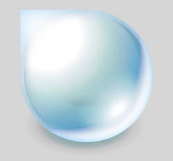
CSS3 Raindrop
This pure CSS3 raindrop is simply gorgeous. It uses a number of gradients as well as other tricks for a stunning image-less result.
Opera Logo in CSS
David Desandro built this CSS Opera logo a few weeks ago. Notice the screenshots of how nicely it degrades across older browsers / IE.
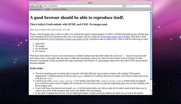
Safari Rendered With Safari
How meta! Check out this Safari UI rendered using Safari. As the page says, “A good browser should be able to reproduce itself”.
CSS3 Aqua Button
This Aqua Button built in using CSS3 gradients is a really nice alternative to image based buttons. Think of all the images you’ll save, since most UI buttons have a static, hover & click state.
Did I Miss Any?
There are tons of great pure CSS rendering demos out there. Please post any ones I missed in the comments below (if they don’t use any images).




Very interesting post, I will be attempting some CSS shapes now for sure 🙂
I created a CSS Washing Machine intended for FireFox.
http://bit.ly/9E3CXh
Good stuff Jeff!
Thank you dear Raasch,
I copied and using some of your codes, so much tanks to your nice web site. 🙂
Love the CSS raindrop 🙂
Jeffrey,
That CSS Washing Machine is amazing!!!
How much time did you take to make it?
Did you know that browsers use CSS for their UI? I was amazed that I could get rid of that orange button in the new firefox 4 with pure CSS. I could even make it transparent if I wanted to.
It’s Informative for me.
Thanks a lot 🙂
Very nice 🙂
I just drew an angrybird with pure CSS,no canvas,no SVG.http://www.tortorse.com/archives/381
the raindrop only works in firefox, all the css properties are on -moz
Awesome stuff. I still have trouble drawing with paper and pen.